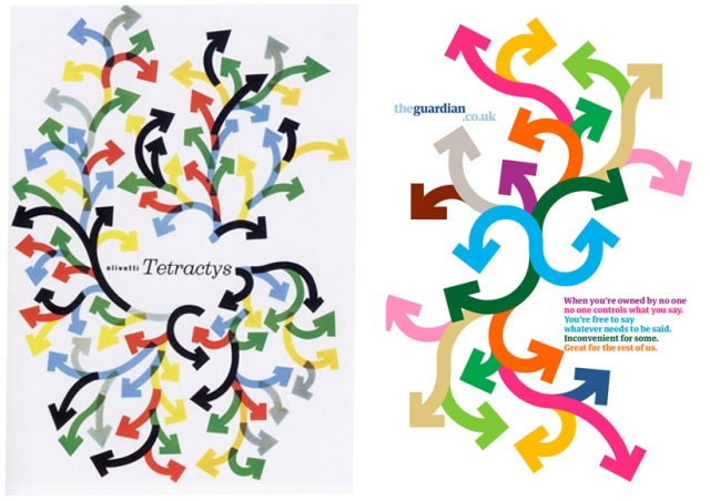
When The Guardian first ran their rather beautiful set of print ads executed by Wieden + Kennedy back in 2007 there was something intriguing about one of the posters in particular. Something familiar. At the time I put it down to the ‘I wish I’d done that’ feeling. Also the fact that they were so polished and well executed there would be an immediate ‘rightness’ about them.
Fast forward to this morning and a link to some lovely old Olivetti print design work on flickr. Low and behold, a poster for Olivetti by Giovanni Pintori that must have sparked that feeling of familiarity 18+ months ago.
The original Olivetti poster by Giovanni Pintori from 1956 next to the Guardian print ad of 2007
Surely there must have been some influence here for the Wieden + Kennedy designer? I’ll leave it up to you whether that influence has stepped over any marks, imitation being the sincerest form of flattery and all that. Take a look at the full flickr set of Olivetti work. And remember, no Illustrator or InDesign in the 50s and 60s – all had cut. Lovely.


Hi Simon,
I definately think you have spotted something there – the use of colour and form – especially the way the arrows grow from each other in a mix of an organic (as in the curves and the overall flow) and the graphic (the bold edges as opposed to any usage of blends or gradients) are too similar to be coincidence. Prehaps it was intended to be a homage to the original?
If you don’t already know it have a look at http://www.youthoughtwewouldntnotice.com/ – it has some great examples of all things inspired rather too directly by existing works…
Take care
Bex
http://www.bubblegumkitten.com
http://bubblegumkitten.wordpress.com
I want to clear this up for good. I created the campaign.
The poster referred to, was a vertical execution of a poster
that didn’t really match pintori’s (unless you count match as colored lines which means that it also copied the underground map) . The layout similarity was subconscious not copied. The other posters in the set bear no resemblance to Pintori, but when I realized what I had done, instead of pulling the poster in an effort to bolster my belief in my own originality, I converted the central arrows, (blue green ) to a big ‘G’ for Giovanni. So that everyone would know, that I understood the relationship. Designers fool themselves with the ignorant pursuit of their own originality. Subconscious influence, sampling and resampling are part of design, you just have to be honest. A big G did that for me. So plagiarism it is not.
Pingback: We Made This Ltd